Case StudyNutmeg
Improving the mobile onboarding journey
- Onboarding
- Fintech
- Mobile
- User testing
- Company
- Nutmeg
- Role
- UX/UI Designer · Mobile
- Scope
- Research to tested prototype
- Duration
- 2020 · 8 weeks
The work
Turning the wait
into product time
The Nutmeg mobile app didn't have a native way for users to create a new account. Tapping ‘Sign Up’ sent people to the web platform in their phone browser, and after sign-up they waited a couple of days for verification before they could do anything with their money.
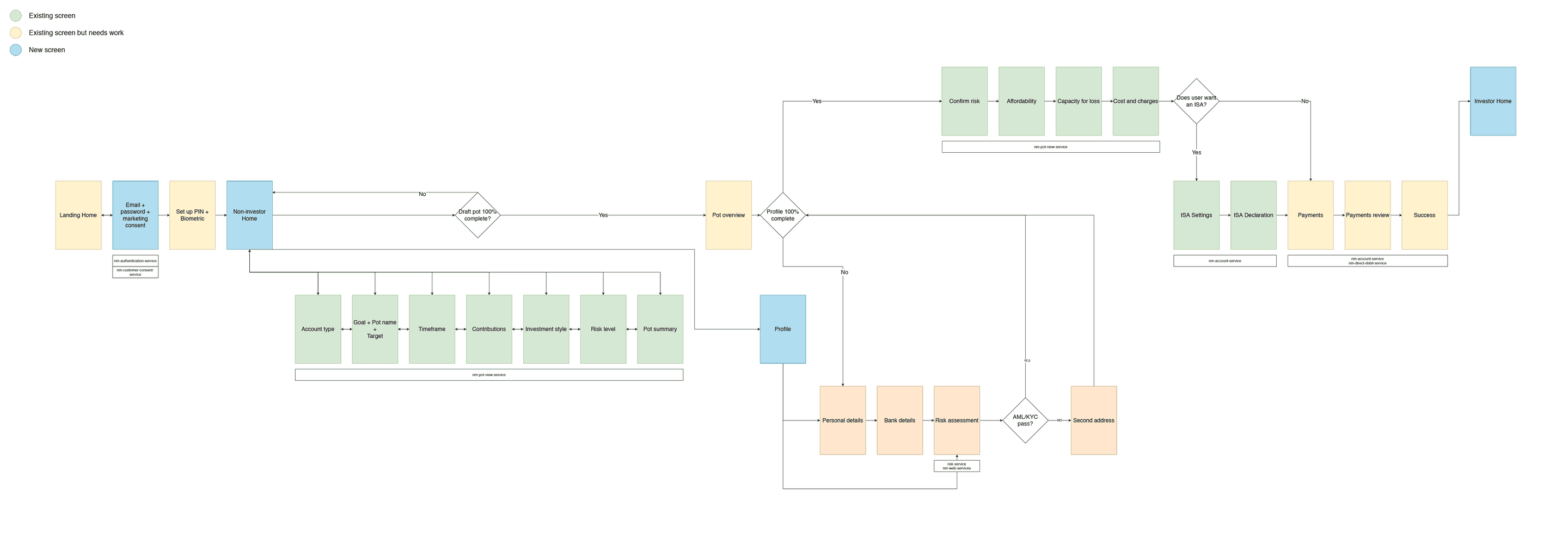
I was the designer on the redesign, working with the product manager, a UX researcher, and the mobile and web engineers. The idea: create an account with just an email and a password, and let people engage with the product and run portfolio projections in the app straight away, with personal details and identity checks coming afterwards.
Over eight weeks I ran the competitor research, mapped the journey against what the legacy backend could support, built a conditional-logic prototype in Axure, and tested it over three rounds.
- Weeks from research to test
- 8
- Rounds of remote user testing
- 3
- Iterations before first test
- 7
- Versions tested head to head
- 2
The problem
You could get
the app but
not an account
After downloading the mobile app, new customers were redirected to the web platform in their phone browser to create a new account. Behind it sat a legacy onboarding process where every step depended on the one before, so the journey was long, and making it flexible would have needed real backend work.
Making sign-up native meant changing the web journey too, so the two stayed consistent. We agreed to do it in phases: shorten the web flow first, then bring it in line with the native one.
On the website, a simulator showed how investments could grow over time, but it was not part of onboarding. After sign-up came a couple of days of silence while verification ran, with no way to see what the product could do.
The idea
Let them explore
while verification runs
The concept had two states:
- A user is anyone who signs up with an email, a password, marketing consent and the terms.
- An investor is a user who decides to start investing and provides personal details, an address and bank account information to pass KYC and AML checks.
Users could build a pot and run portfolio projections straight away, using the simulator in their own time, so the wait for verification became time in the product. A learning hub was in the first version of the flow. We cut it from launch because it added complexity and users could still reach the blog and knowledge base.
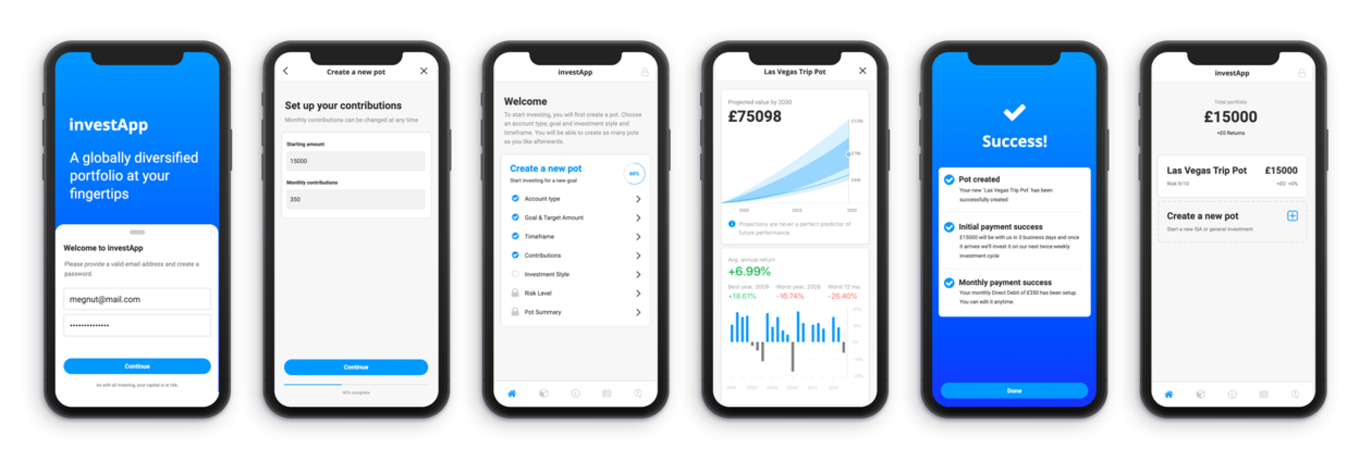
The waiting for account verification became time interacting with the product.
The approach
Eight weeks,
four steps
This was the first project at Nutmeg that I was involved in from the start, which meant I could shape the solution, not polish one. I drafted a plan for the eight weeks that moved from outside-in research to inside-out validation: competitors, then the journey with product and engineering, then a prototype, then users.
I worked closely with the product manager throughout, and with a UX researcher on the testing. I presented the findings at a company all-hands.
- 01
Analyse competitors
Week 1. I printed competitors' sign-up journeys on A3, put them on a whiteboard, and left them in an office corridor for anyone to annotate. With the product manager I turned the trends into a feature matrix.
With product manager - 02
Map the journey
Week 2. I mapped the journey with product and agreed with engineering what the legacy system could take. The learning hub was cut from launch. I also spotted that the flow did not let people open an ISA. We had just implemented that journey in the mobile apps, so leaving it out risked conversion. I raised it with the PM and we agreed to add it to the flow.
With product + engineering - 03
Build the prototype
Weeks 3 to 6. Projections and step checks had to react to what users did, so I built a prototype in Axure with conditional logic and sample data. A mobile developer helped me design the data structure behind it.
Prototype: mineData model: mobile dev - 04
Test with users
Weeks 7 and 8. Three remote rounds. Round one covered new, intermediate and experienced investors and existing Nutmeg users. Later rounds rewrote scenarios and tasks, then tweaked the flow. Key quotes went into Dovetail.
User testing: mineTest scripts: with UX researcher
The prototype
A prototype with
real logic
Testing needed projections and step checks that reacted to what users did, so linked screens were not enough.
01 What it needed
Calculations and conditional logic, with sample data that returned realistic results as people explored the app and started a pot.
02 How I built it
Axure was new to me, so I gave it a week of tutorials, built the most important conditional flow and tested it with mobile developers.
03 What we left out
We left the real brand out of the test, but every screen was based on the real app. It took seven iterations to reach the first version for users.
The test
When users disagreed
with the plan
Testers liked starting with only an email and a password. Some did not realise they were exploring projections, not yet investing.
01 What the tests showed
Testers liked creating a pot straight away and being asked for more details afterwards. But during testing, some did not realise they were only playing with projections, and that they still needed to complete their profile and pass the legal checks before they could invest. Across three rounds, 73 observations were tagged in Dovetail, led by clear next steps (19), easy navigation (12) and progression visibility (11). Interactive prototypes can mask real issues because testers want to succeed, so I treated the praise with care.
02 Where we disagreed
The product manager's first move was to fix the test: a new scenario and clearer tasks, since testers might be rushing or treating it as not real money. That was a reasonable reading. I read it as a comprehension problem. Some testers did not realise they were exploring a projection, and that investing needed a completed profile and the legal checks behind it.
03 What I did
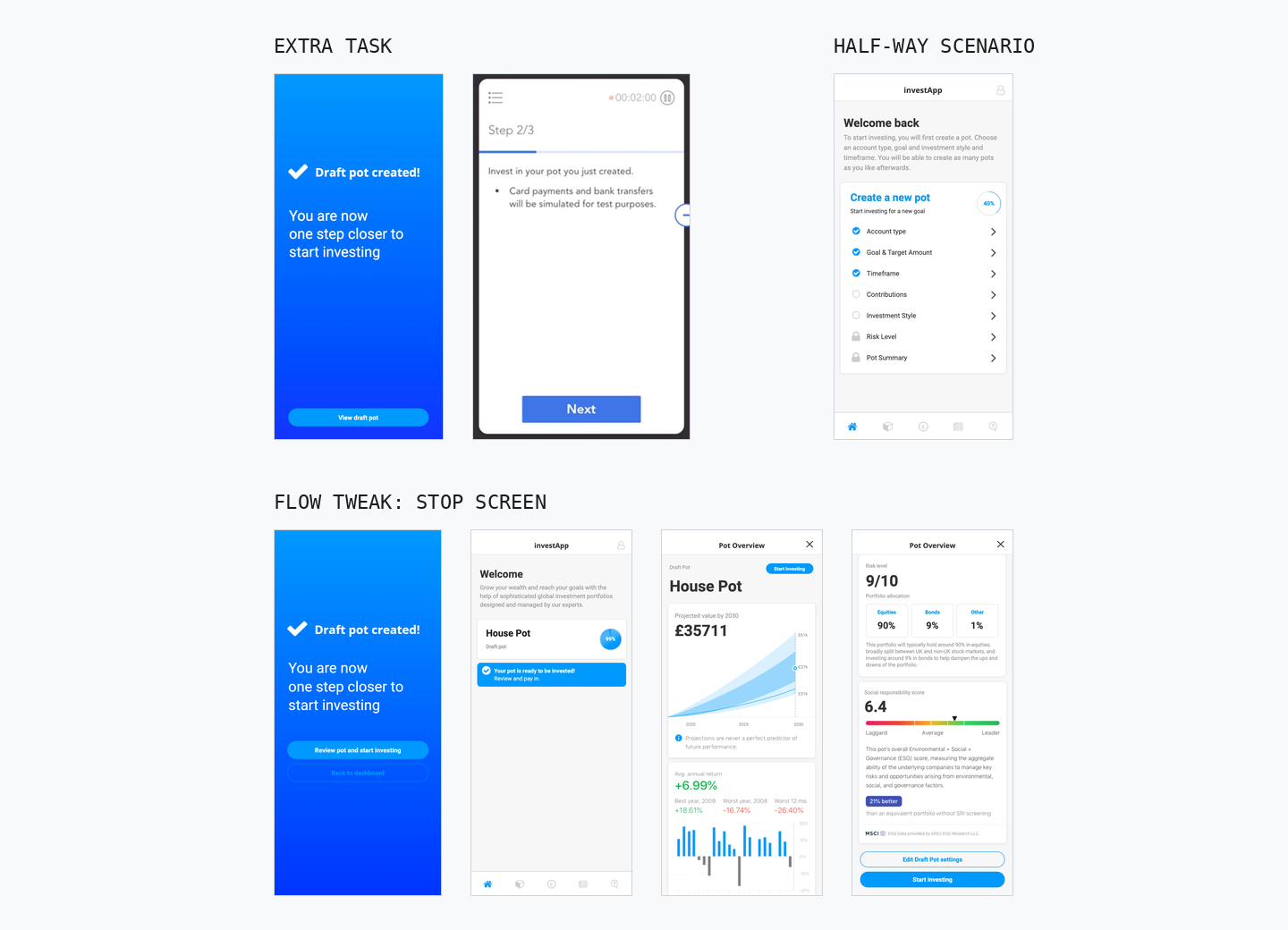
Round two rewrote the scenario and tasks, and testers still stopped at the draft pot. For round three we ran two versions. One added an extra task prompting testers to carry on until the pot was funded. In the other I proposed a stop screen after the draft pot is created, saying the pot is a draft and one step from investing. It offered two routes: review the pot and start investing, or return to a dashboard showing a 99% complete draft pot and a prompt to finish now or later. A half-way scenario tested how an unfinished account reads when testers come back to it. I can't recover how each version scored, but the session notes do show the stop was tied to the draft pot screen: one tester did not scroll to the continue button, and another note suggests changing the button placement or copy.
Reflections
Validated,
not measured.
Three rounds of remote testing supported the concept, and one tester said it was a lot better than most apps they knew.
The research and prototype went into a delivery brief for native mobile onboarding, with designs for the first mobile version due in May 2020. The brief set one success metric, accounts created on mobile versus web. I had no way to track it, and I can't confirm what shipped. Nutmeg was later acquired and rebranded, and I can't open a new account to check.
I ran this alongside design systems work at Nutmeg, including an iOS theme with dark mode, so this case shows the product side of that range.
Learnings
- 01
Rule out the test before blaming the flow
Rewriting the scenario was a fair first step. When testers still stopped at the draft pot, it pointed us to the flow.
- 02
Flexible onboarding needs honest states
Letting people explore before they are verified only works if the app is clear about what is exploring and what is investing.
- 03
Legacy constraints belong in week one
Agreeing early with engineering what the old system could take cut scope before it turned into rework.
- 04
Prototype to the question
The test depended on projections reacting to what users did, so the prototype needed real logic, not just linked screens.
Let's
talk
Open to conversations about design systems, product craft, and what good design infrastructure looks like in practice. If you're building something great and thinking about how it scales, let's talk about it.