Case StudyNews UK
One account,
three brands
- Product design
- Multi-brand
- Design systems
- Company
- News UK
- Role
- Senior UI Designer · Design Systems
- Scope
- End-to-end account pattern
- Duration
- 2021 - 2022
The work
Managing a
subscription
should not depend
on which brand
sold it
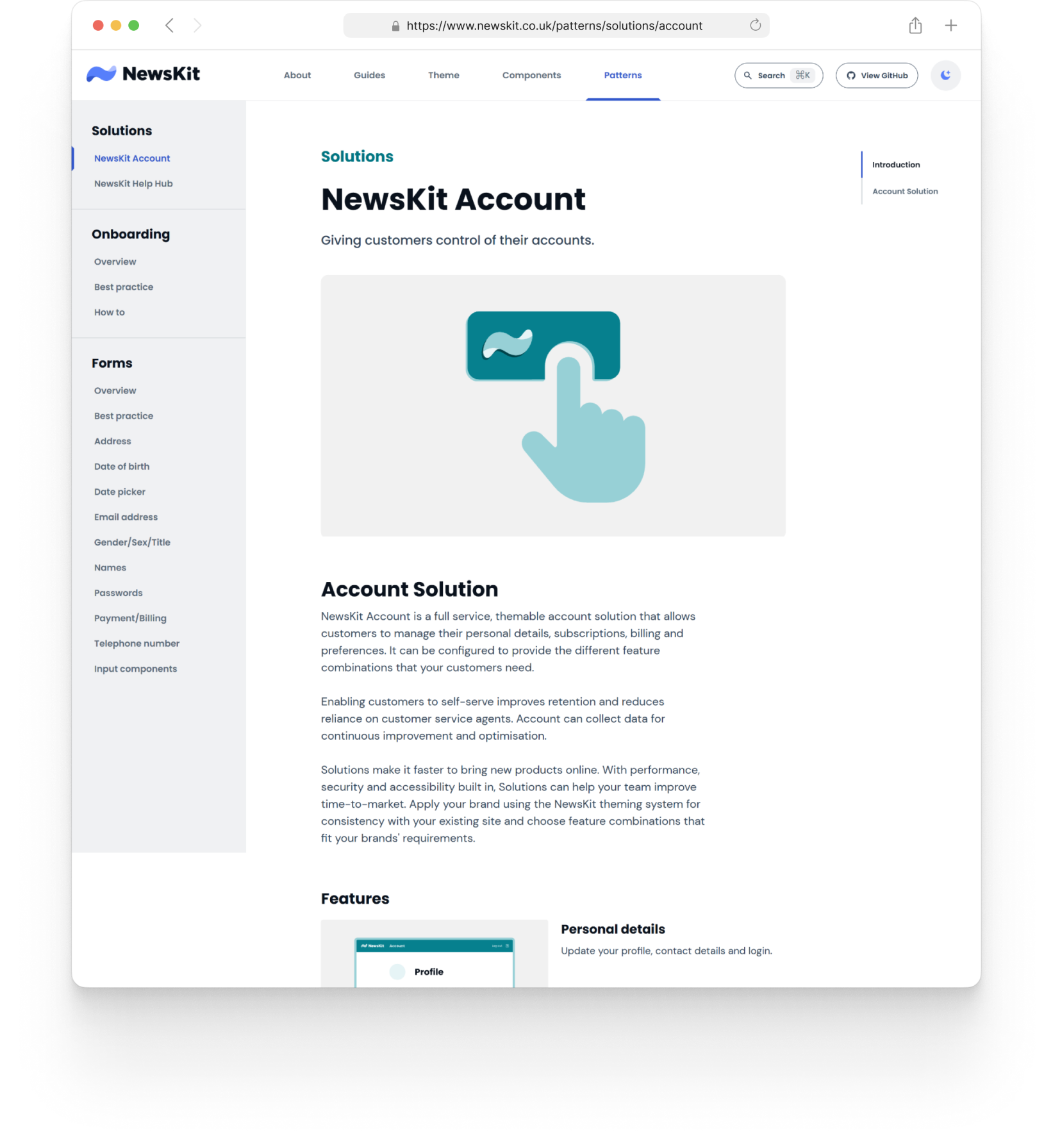
Every News UK brand needed the same things from an account management solution. But The Sun had its own account pages, The Times had theirs, and Virgin Radio was only partly on the system.
Each internal product was building its own answer, with its own maintenance burden, while subscribers were getting a different experience for the same job.
The UX designer and the product manager defined the flows and the testing; I owned the UI for every screen, state and viewport, across three sections, nine edit flows and thirteen subscription and billing states, from free trial to payment failure to termination.
One design pattern that any brand could configure and theme, instead of rebuilding. This is a highlight of the project, not the full record.
- Brands it was designed for
- 3
- Configurable sections
- 3
- Edit flows
- 9
- Subscription and billing states
- 13
The problem
Same job,
different product
experiences
Every brand needed the same things from an account: update your details, manage a subscription, fix a failed payment, change your mind.
The edge cases were where it mattered most. A payment fails, a trial ends, a cancellation is waiting on a refund. These are the moments where a subscriber decides whether to stay, and the ones teams usually design last.
So the job was not a themed copy of one brand's pages. It was designing the whole lifecycle once, including the states nobody wanted to own. I made that case internally in a show and tell.
The outcomes
It shipped,
it's live, and
it kept growing
Account launched as a publicly documented Solution on newskit.co.uk, one of only two in the whole pattern library. Any team in the organisation could adopt it and apply their own brand's theme.
The screens live now* are the ones I designed, or iterations of them. Holiday stops were still being defined when I left, waiting on product approval. They are in the public documentation today.
The bet was better retention and a lighter customer service load. I can't tell you whether it paid off. I had no measurement in place for adoption or impact. Years later I checked, and the pattern is still live on at least two brands. That answers adoption, but it can't confirm anything about retention.
*Last checked: The Sun and The Times account - Sep 2026
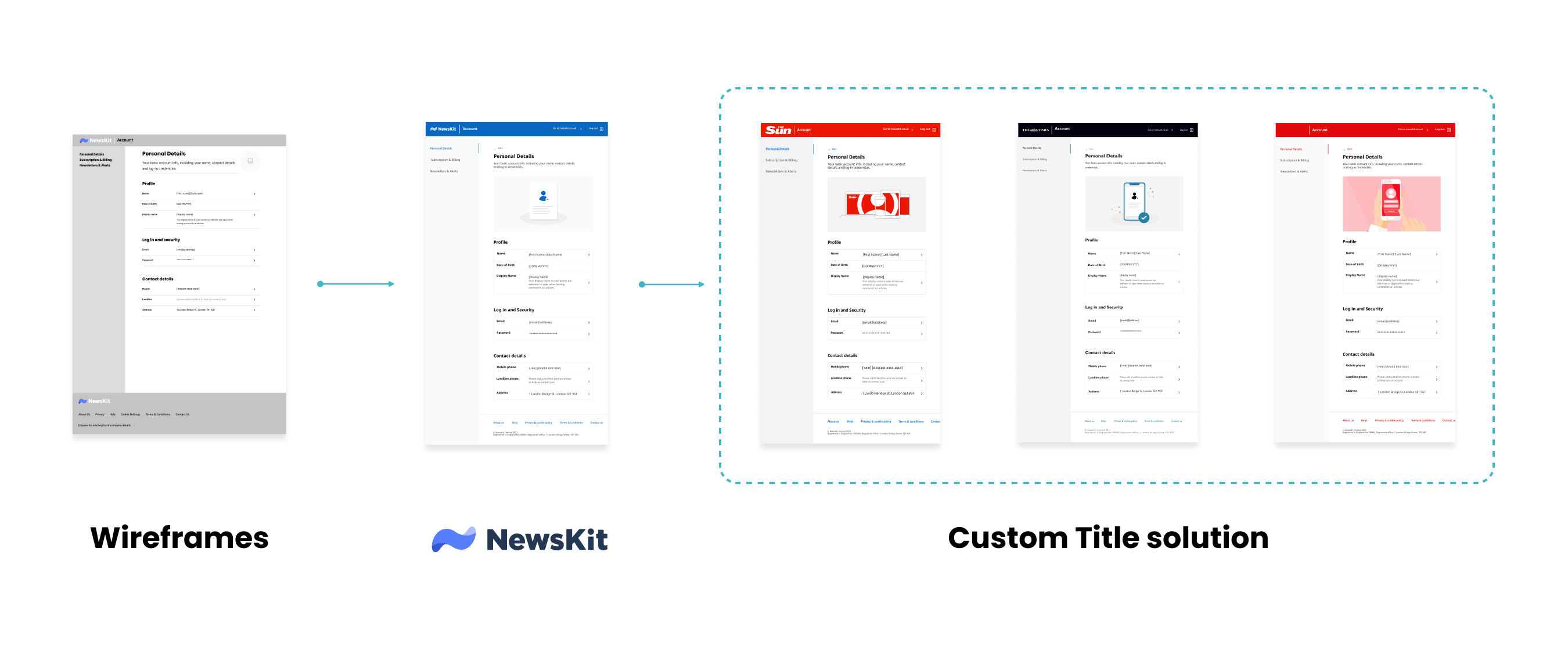
01 / The Times, live
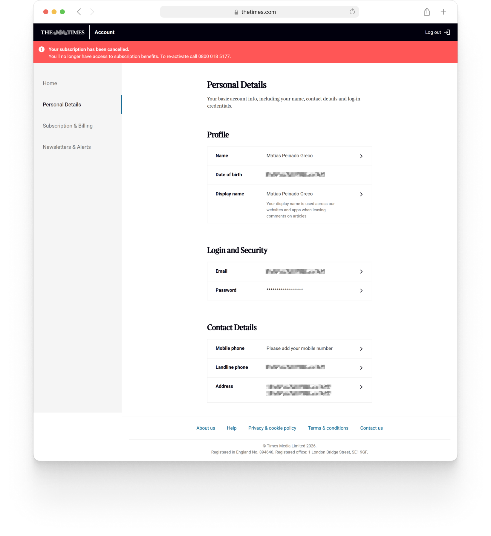
02 / The Sun, live
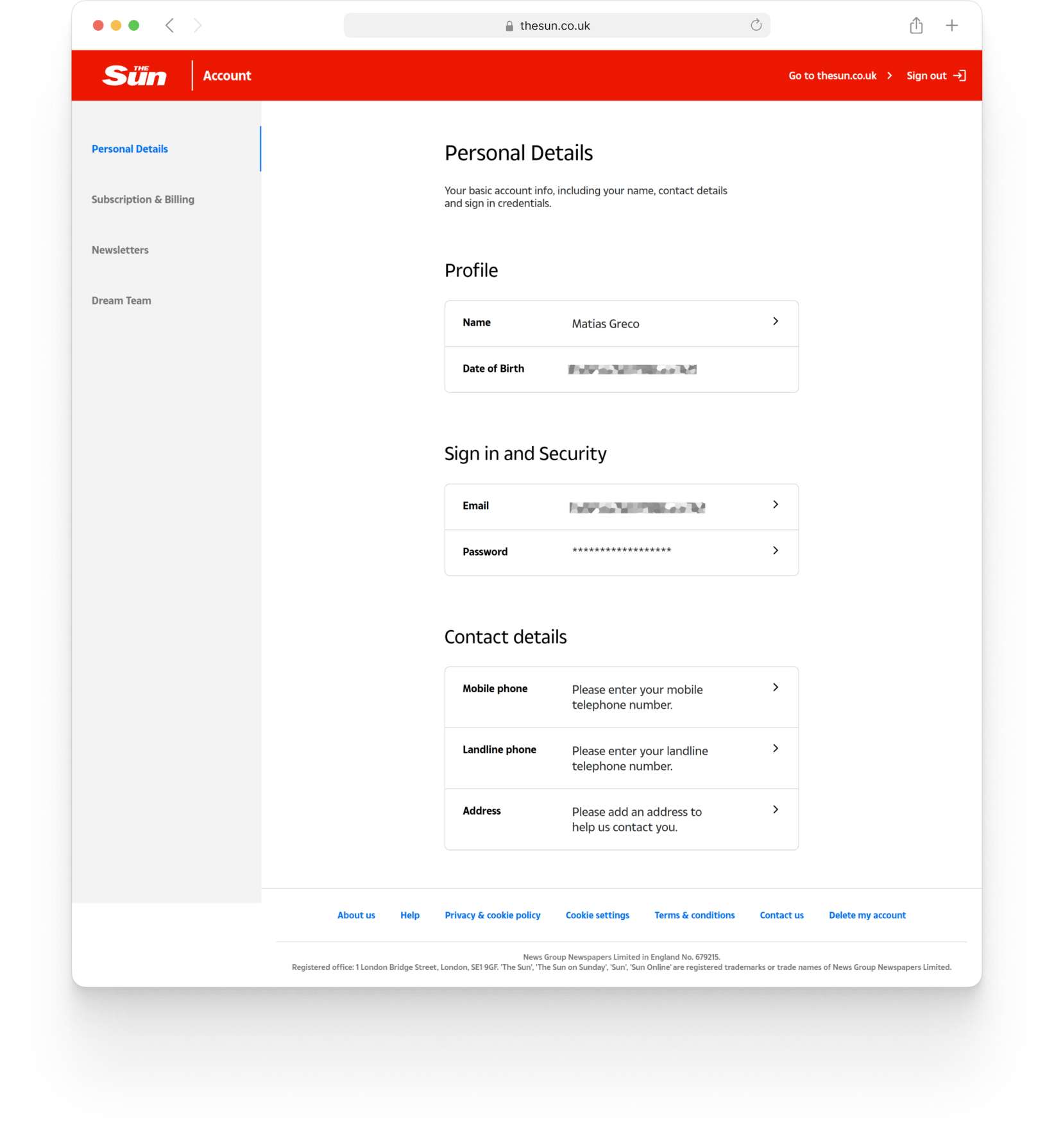
03 / NewsKit docs
The approach
Design every state,
then make it configurable
Design the happy path and the failure paths together. Document every rule so engineering can build from it. Leave brands room to configure sections instead of asking us for changes.
- 01
Design every state
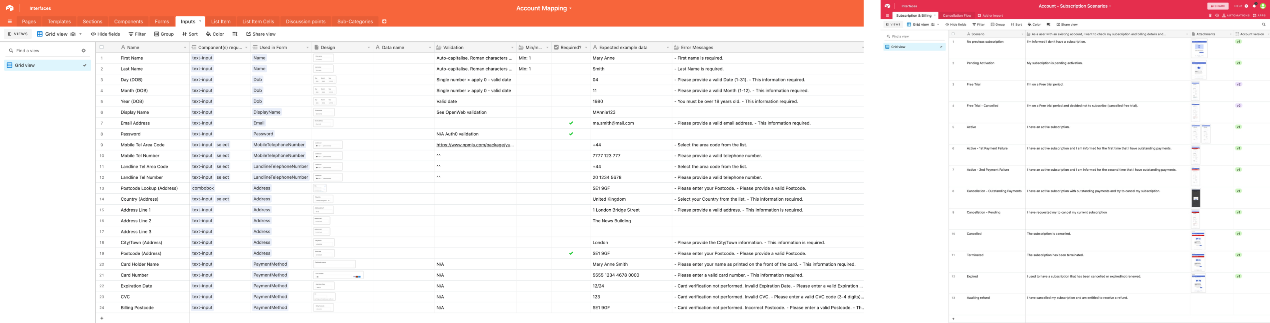
Thirteen subscription and billing scenarios, from free trial to termination. Payment failure escalates through a first notice, a second notice and a terminated state, each with its own banner and next step.
UI design: mine - 02
Design the flows
Nine edit flows across the three sections, each with validation, error and success states. Mapped end to end first, then designed screen by screen, taken from UX wireframes to finished screens. The viewport and responsive layout decisions were mine.
With the UX designer - 03
Make it configurable
I built the Account pages as templates with slots, to speed up the work and reuse them across brands. Content could be swapped and each brand's theme applied without rebuilding screens. I made the slot mechanism by hand, before Figma had native slots. Theming ran through an internal plugin built by our Design Technologist.
Slots: mineTheming plugin: Design Technologist - 04
Document it for engineering
28 components, 9 forms and 24 inputs, each with validation rules, error messages and success states mapped, so engineering could implement directly and had only one reference to look for.
With the UX designer
The experience
One account, multiple configurations
The Account pattern was implemented by the front-end team and made available to any team in the organisation to adopt, themed to their brand. Theming ran through an internal plugin built by our Design Technologist, similar in principle to Tokens Studio but tailored to NewsKit.
The details
Every user story
before any screen
The infrastructure matched the project ambition. The scenarios came first, mapped with the UX designer in Airtable. Each one was written as a user story before I drew a screen, so the states were agreed before the layouts.
Small flows,
real security
decisions
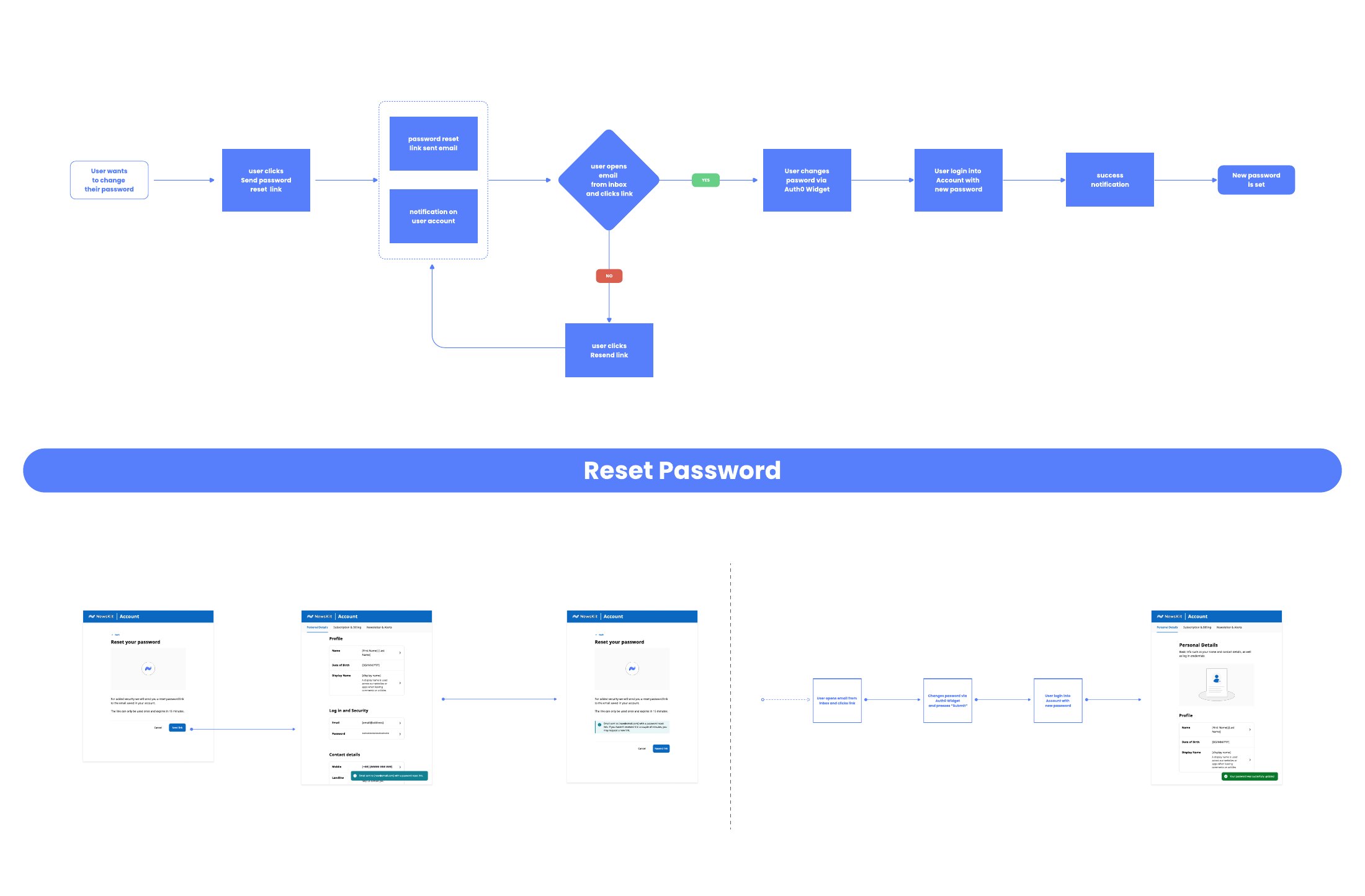
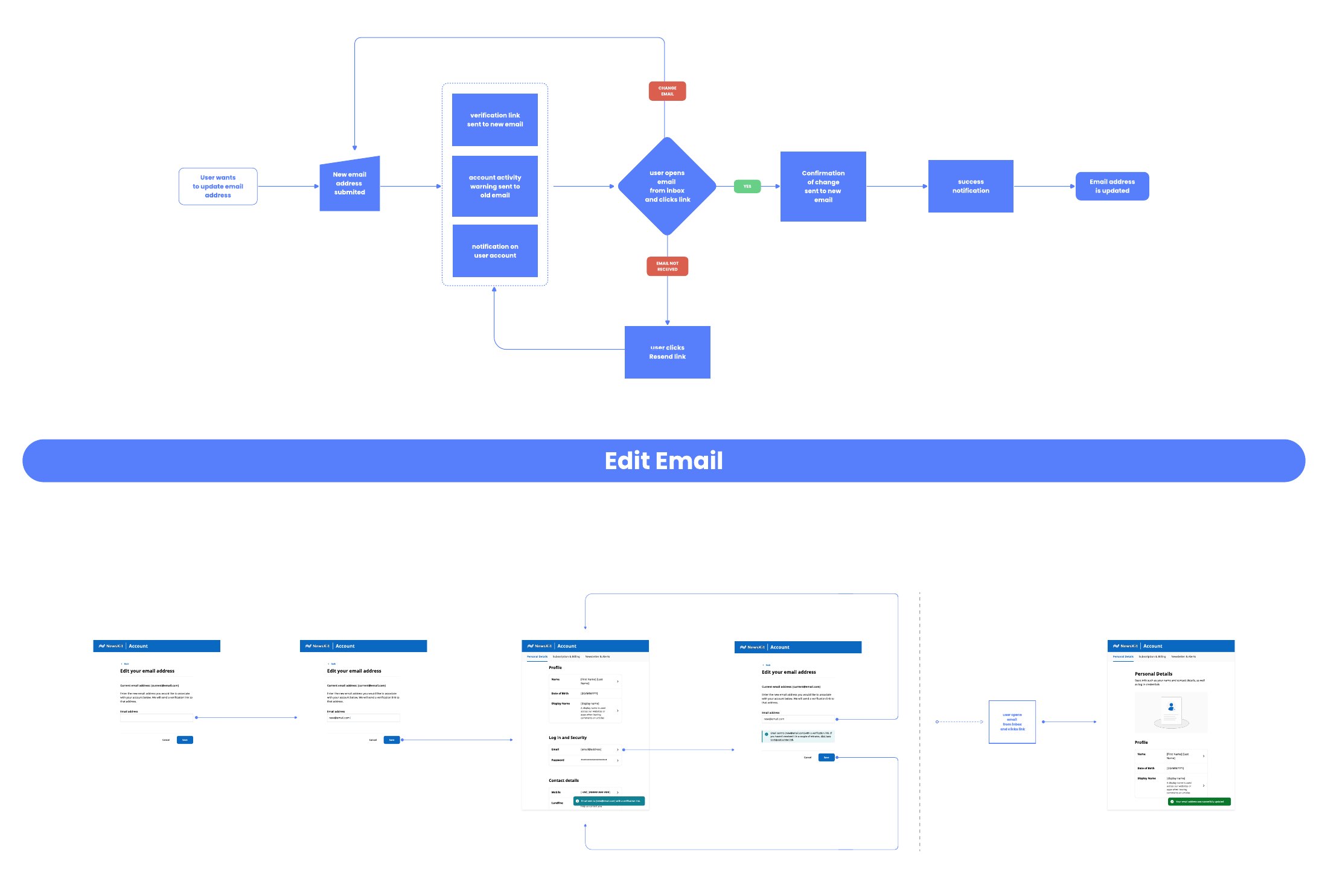
Two of the nine flows show the kind of decision that never appears on a screen. Resetting a password sends a single-use link that expires in 15 minutes, with a resend path and a notice on the account.
Changing an email sends a verification link to the new address and an account activity warning to the old one, so the current owner hears about it. Each flow was mapped first, then designed screen by screen.
01 / Reset password
02 / Edit email
One pattern,
all viewports
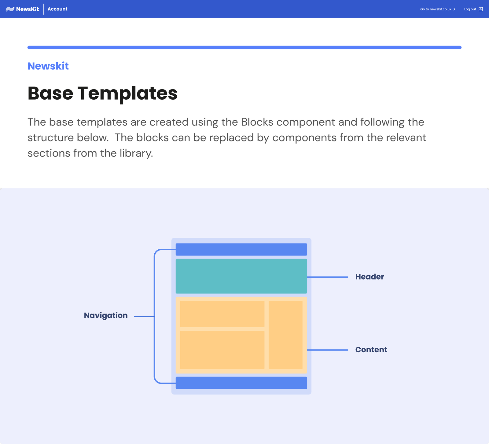
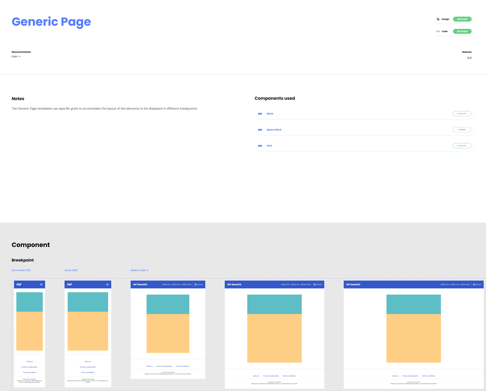
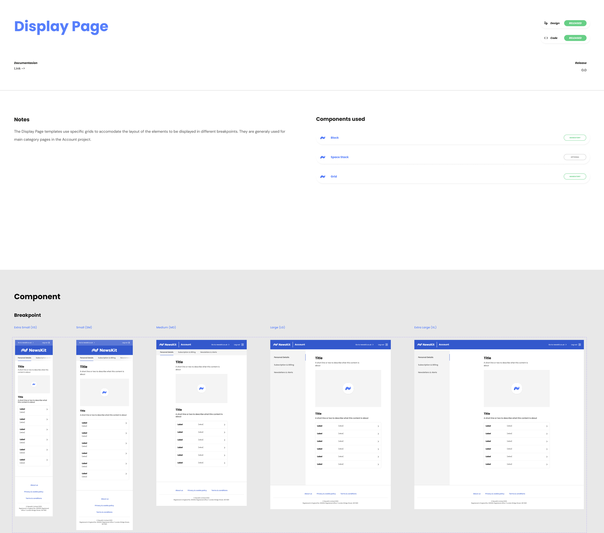
The wireframes gave me the structure. The viewport and responsive layout decisions were mine. The base templates use swappable blocks, and each template was specified from XS to XL.
01 / Slots
02 / Content blocks
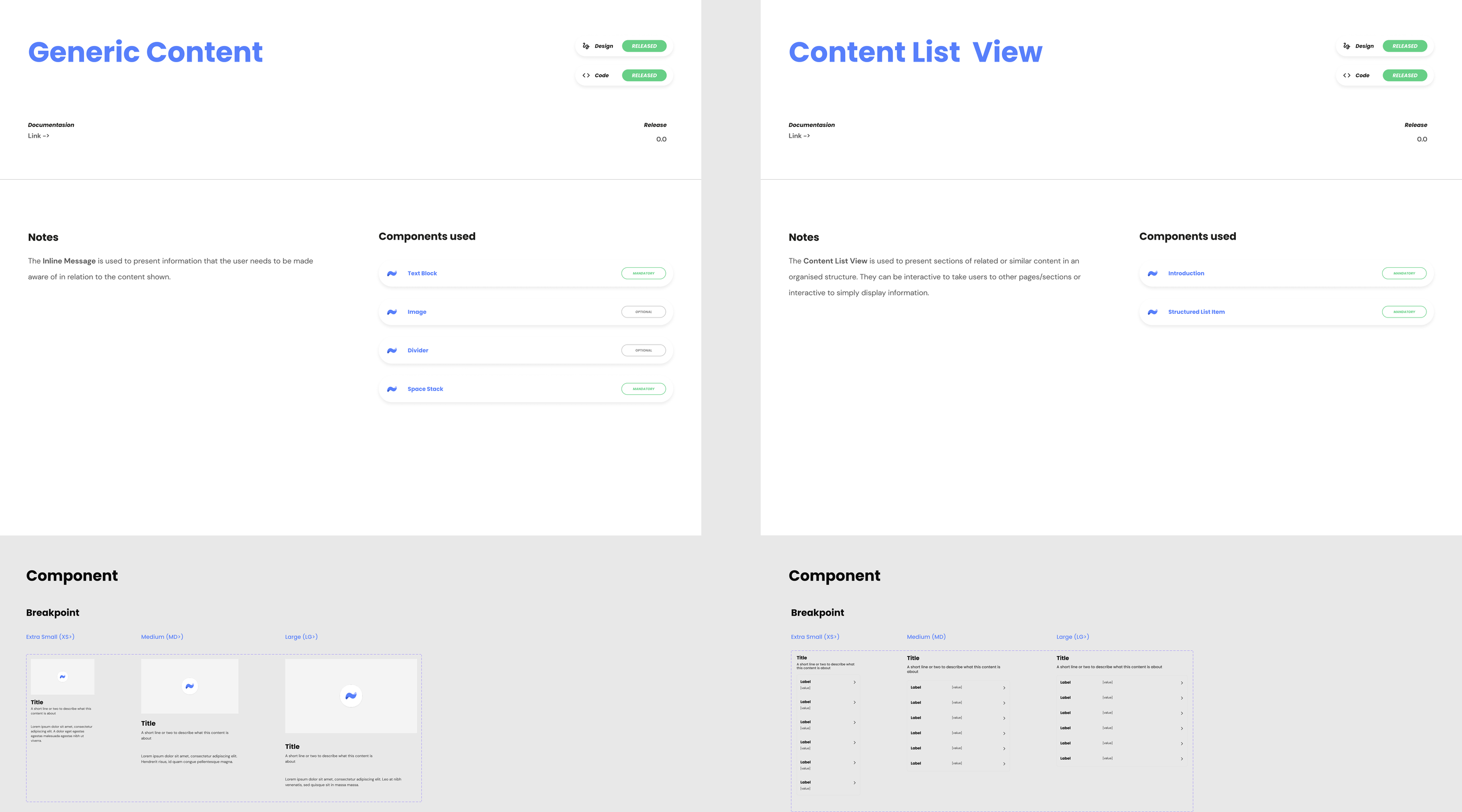
03 / Base template, XS to XL
04 / Display page, XS to XL
Row two: the Generic Page, and the content blocks that fill the slots. Design and code both released.
A file organised
for handoff
The file behind the cancellation journey, page by page: Final UI, Components, Handoff, Pages, Flow and the prototypes. One file, multiple themes, the full lifecycle.
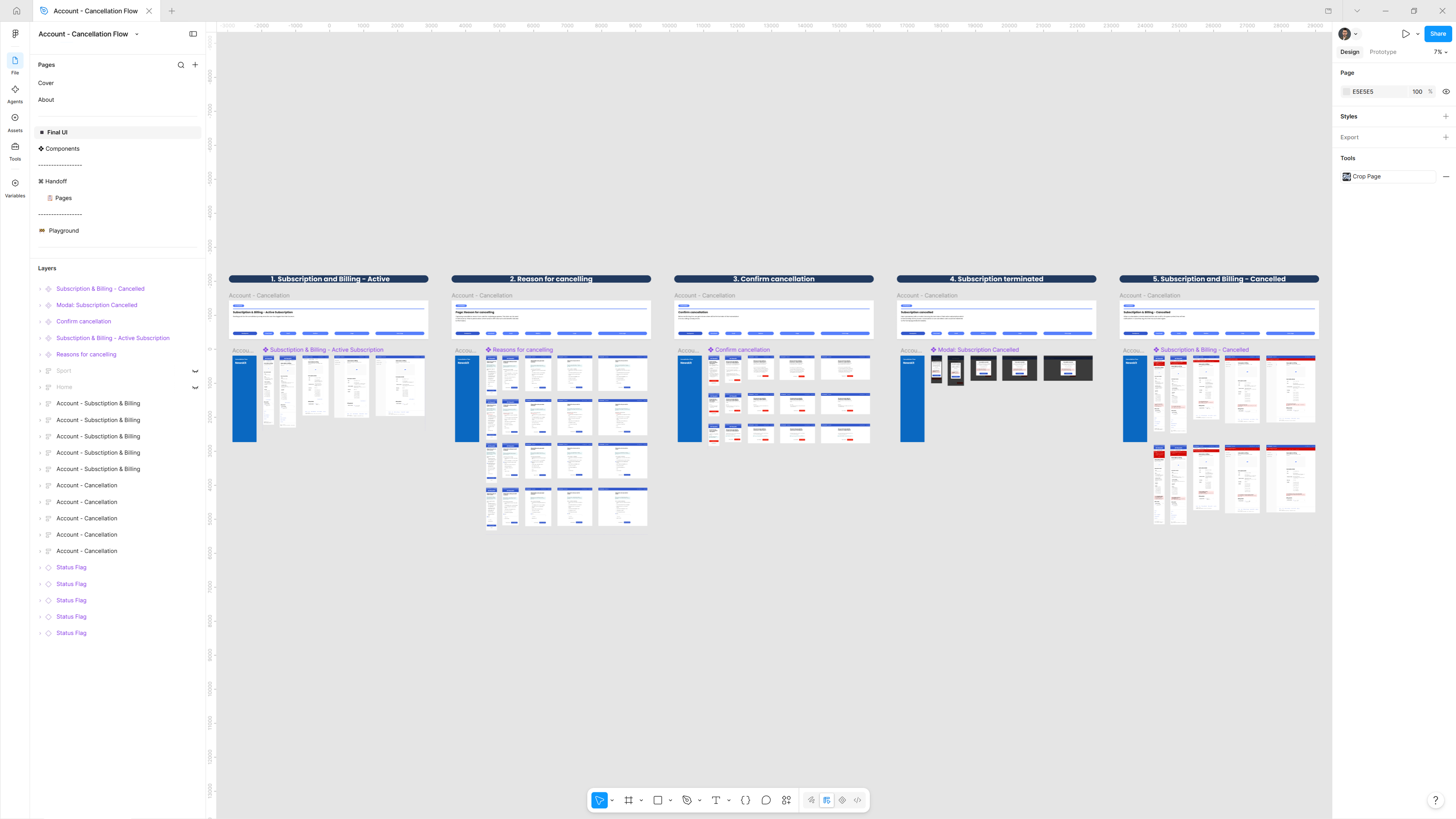
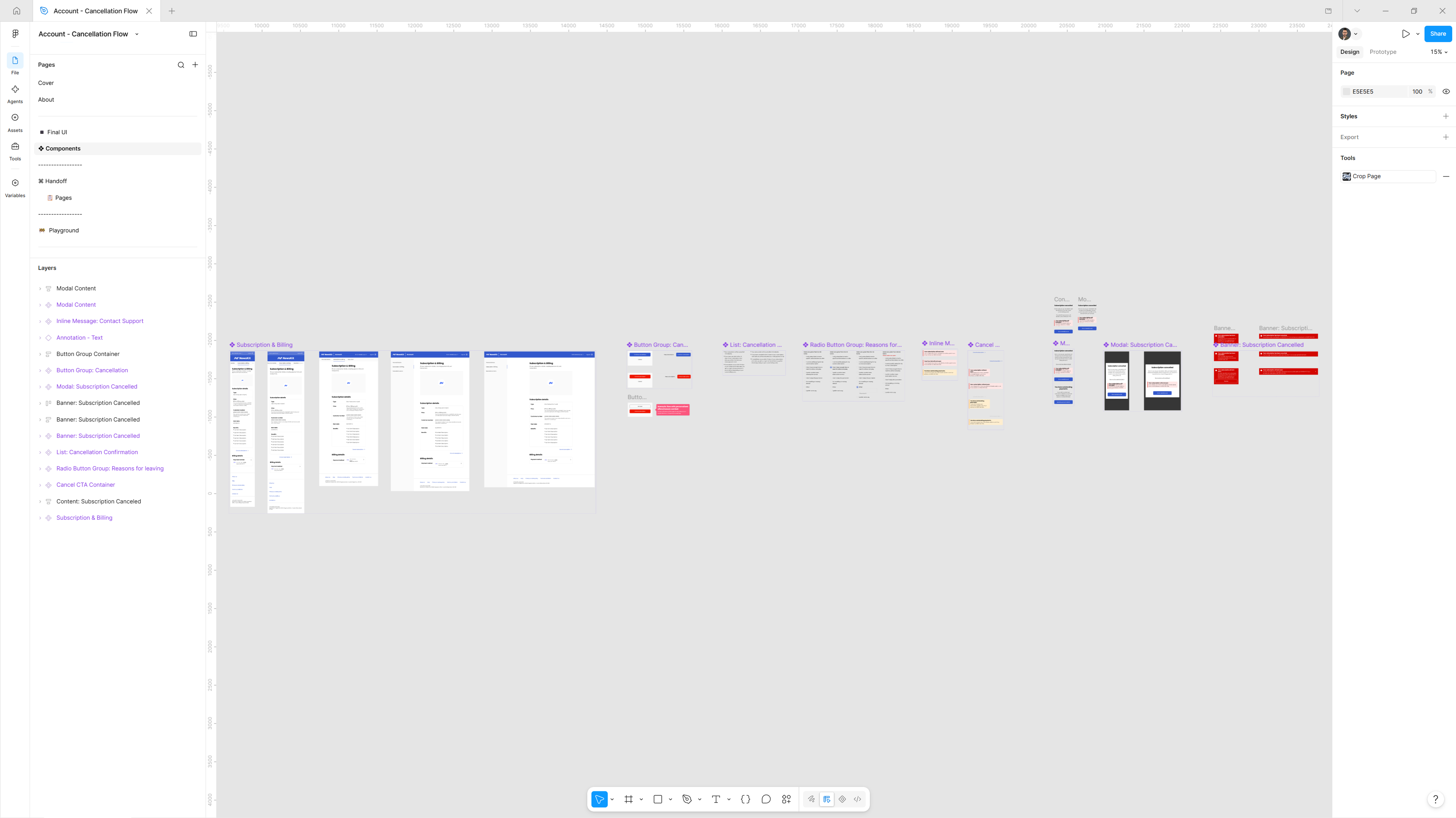
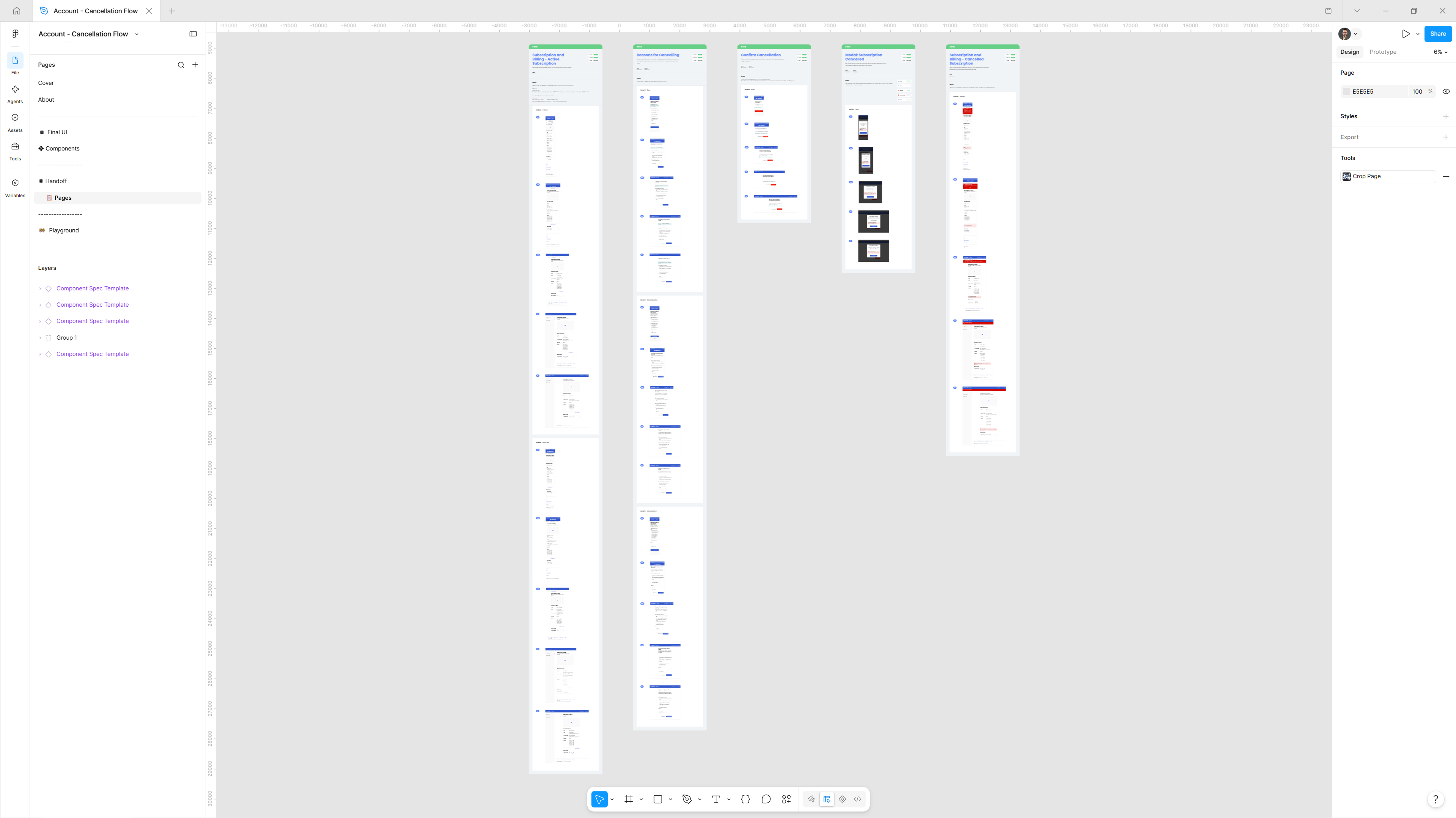
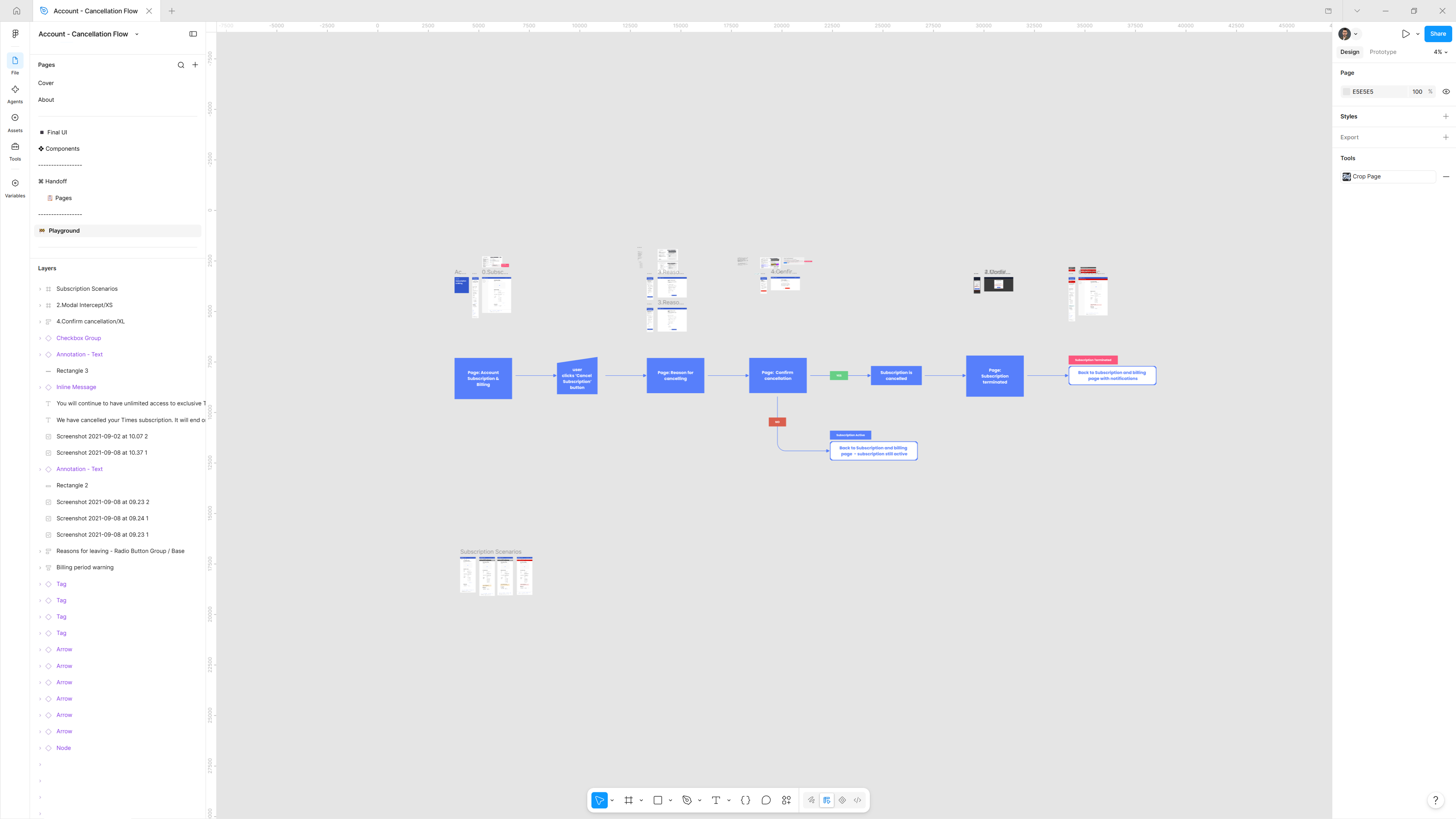
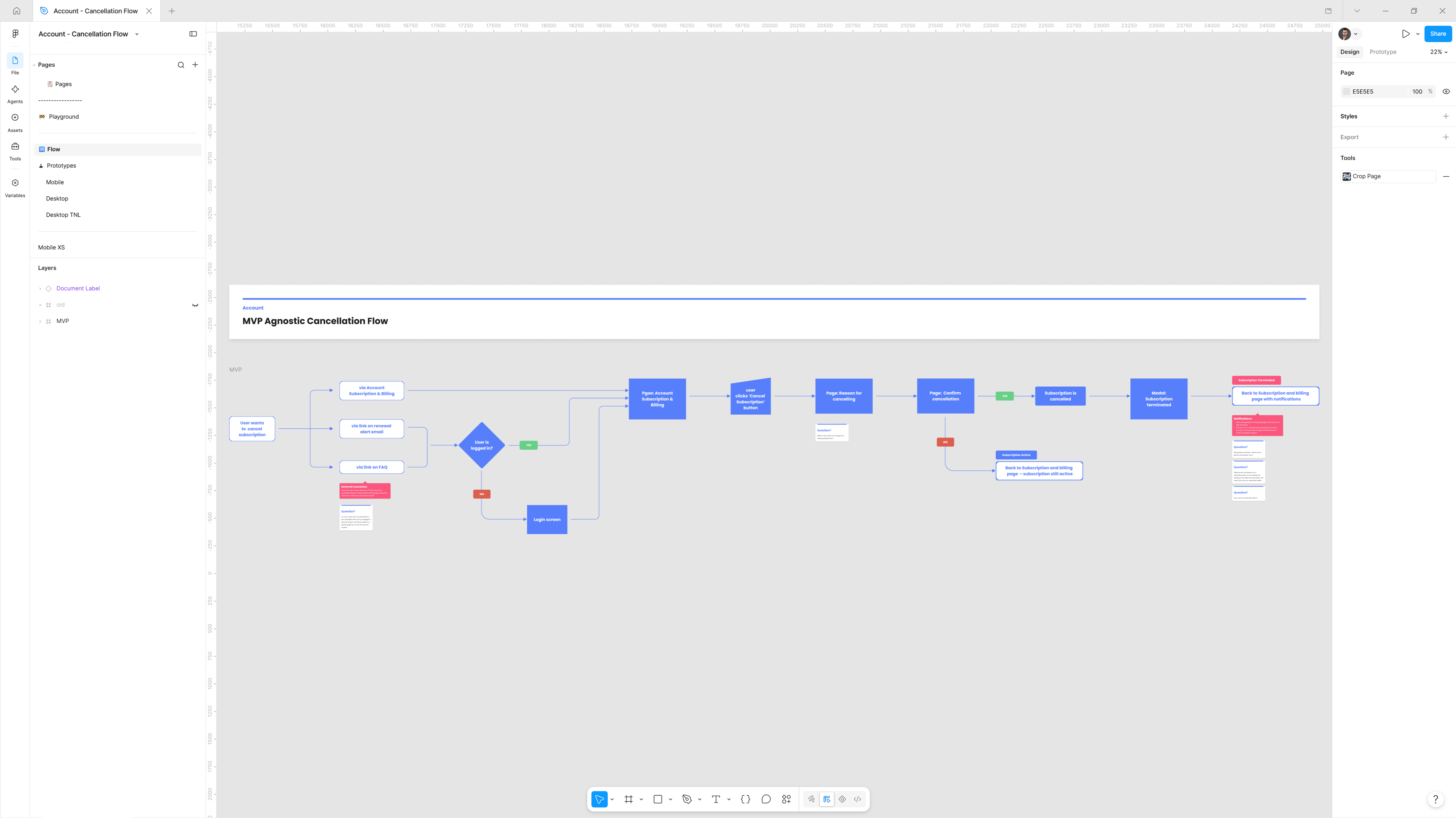
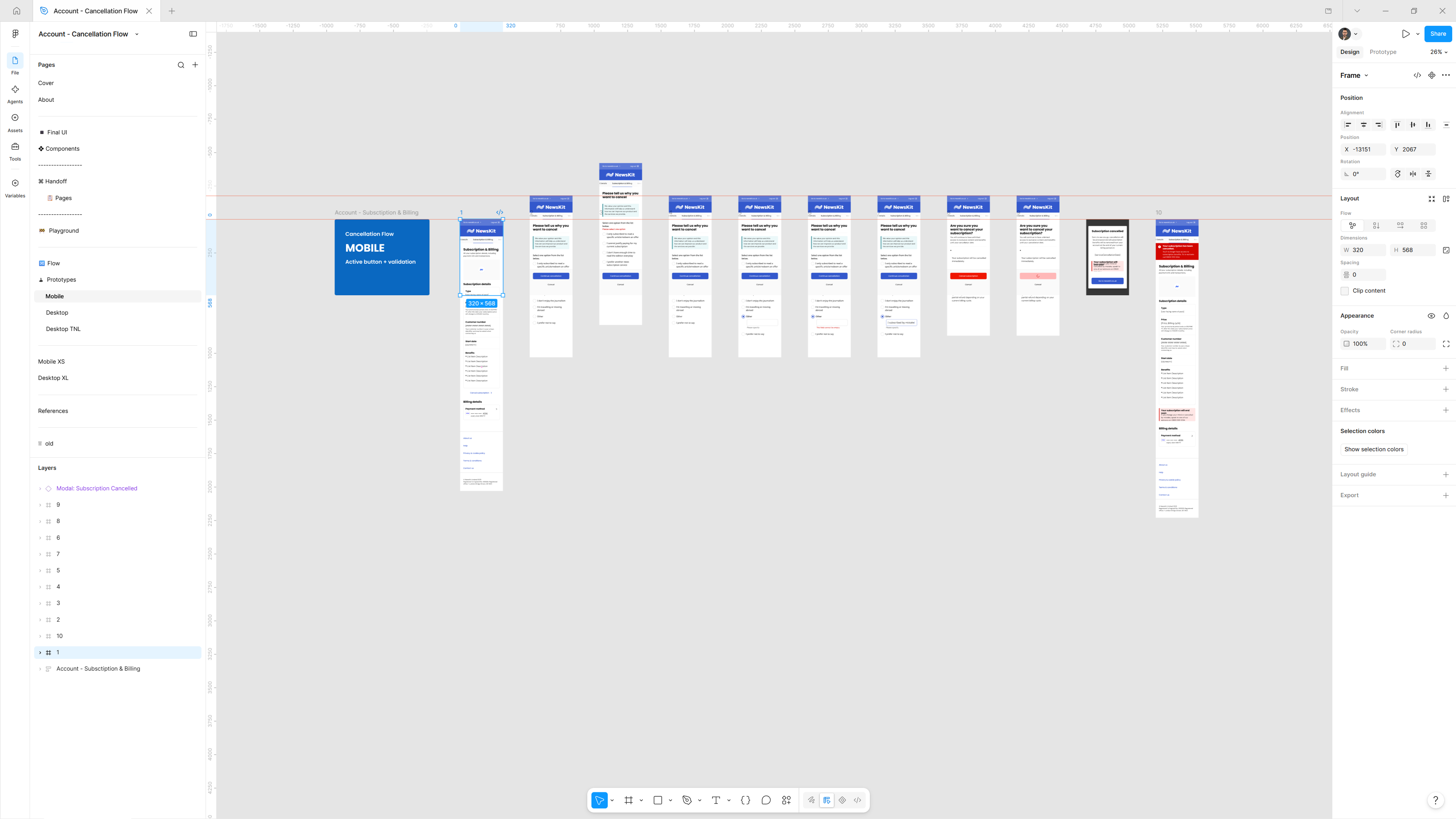
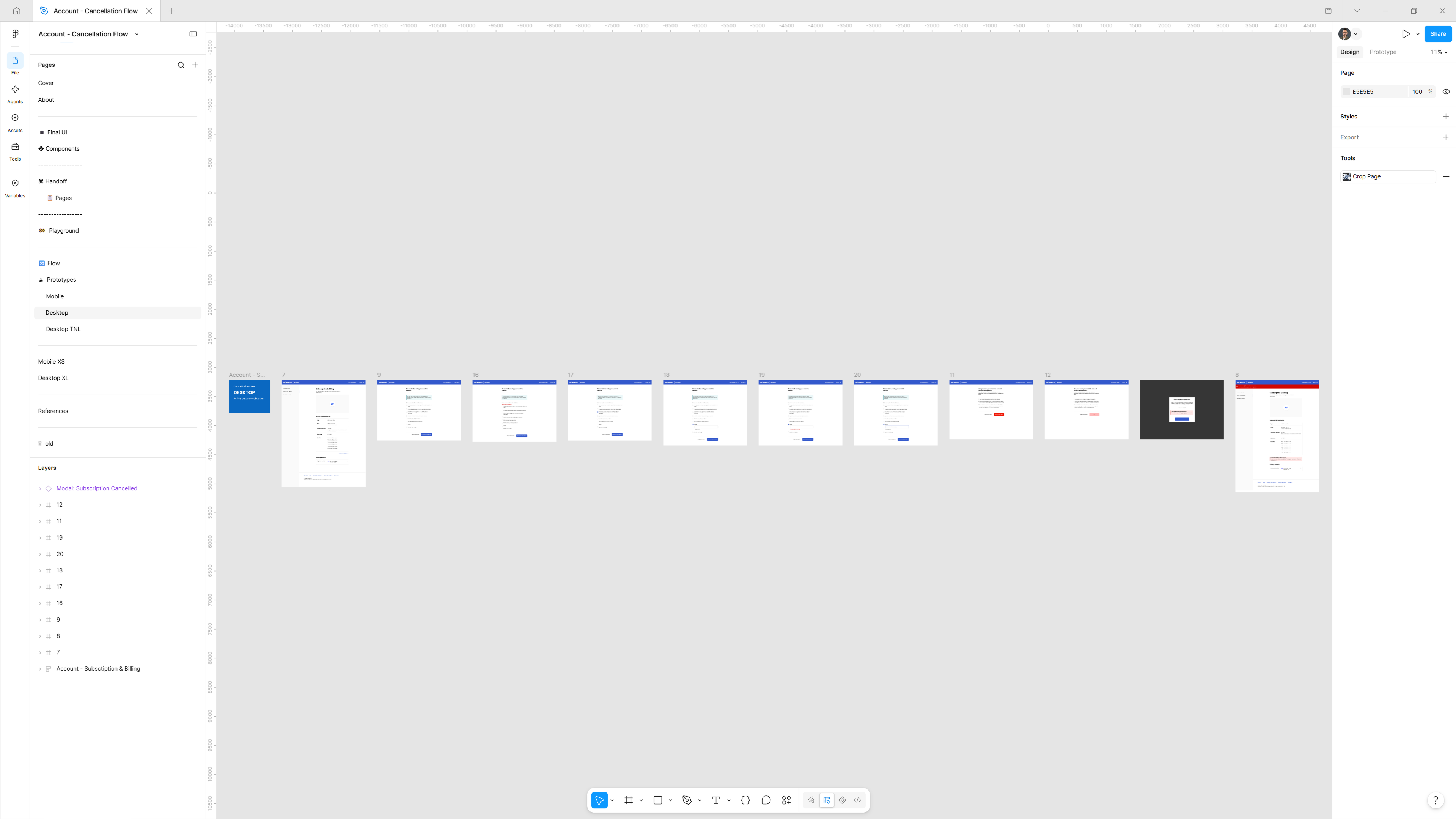
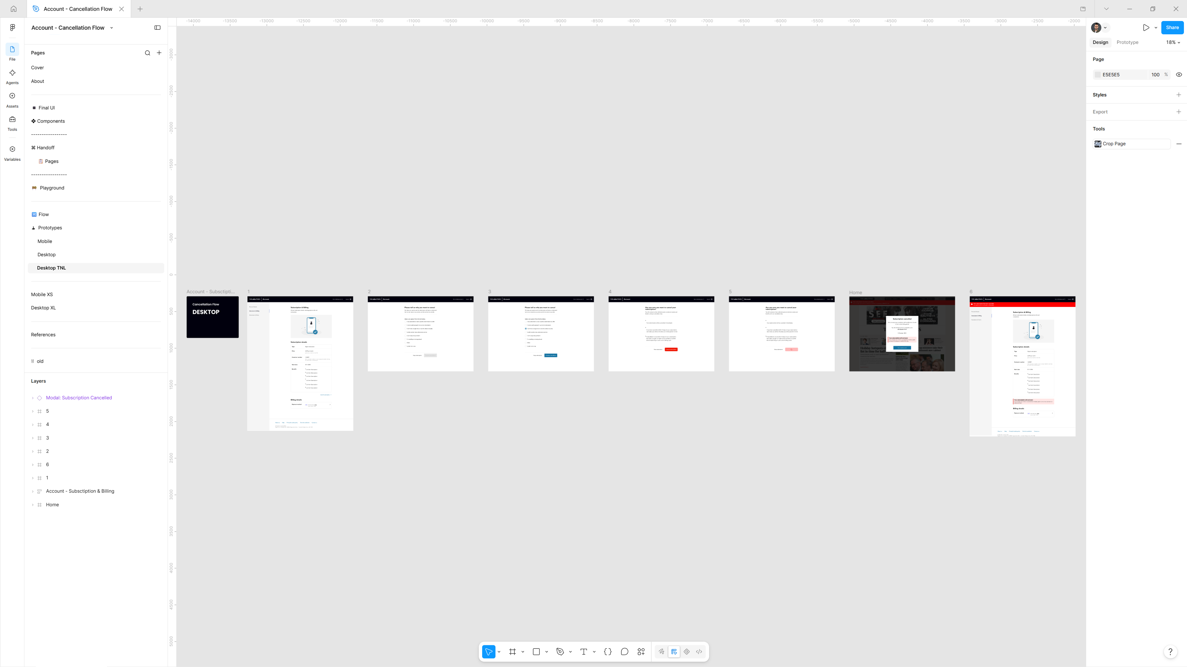
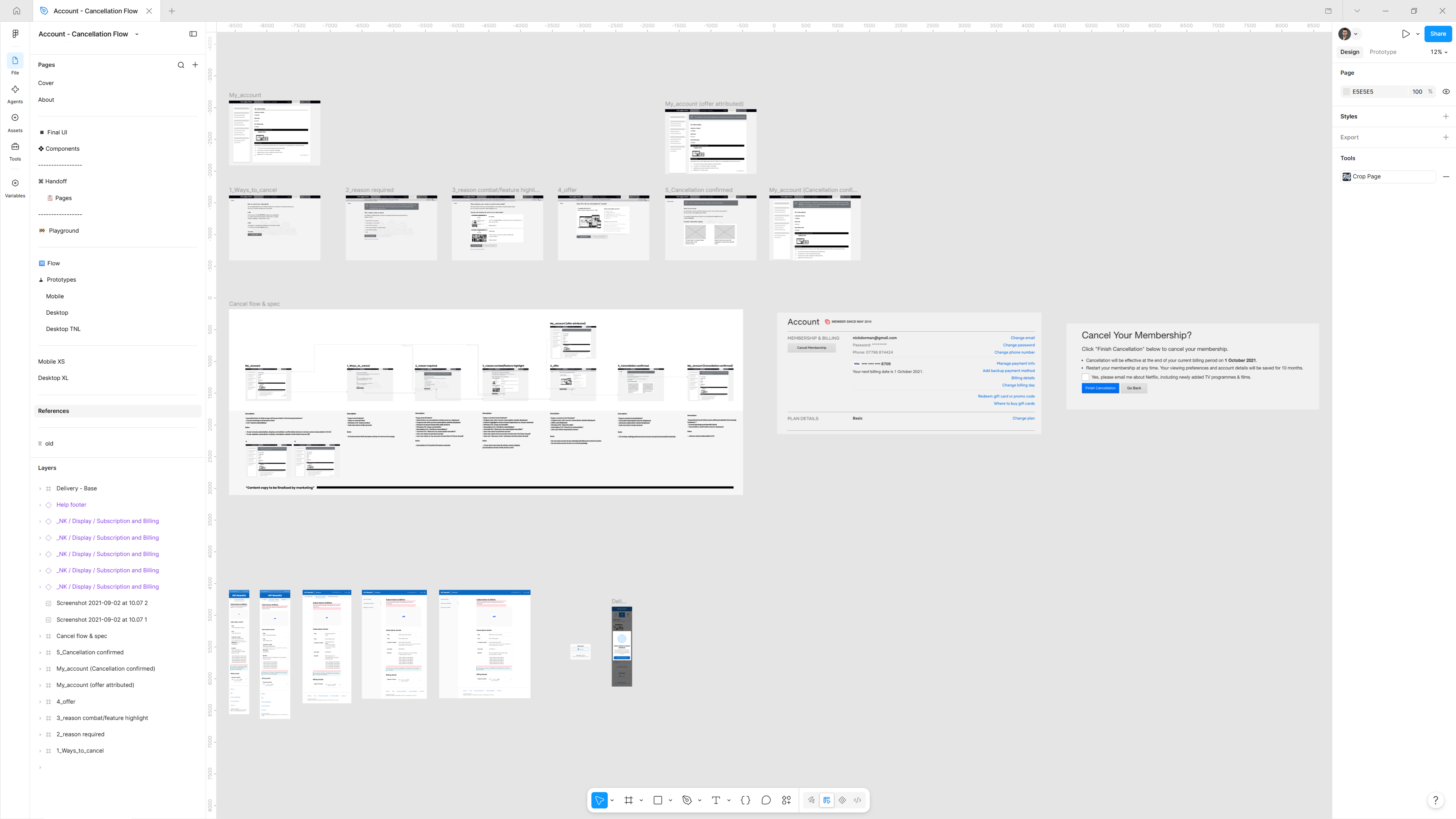
01 / 09 Final UI: the cancellation journey in five steps, every state.
Different themes,
live-action prototyping
Building up from the templates and project infrastructure, the concept prototypes were matched and configured for each brand as needed, by simply choosing the themes and letting the Figma prototype work its magic.
01 / NewsKit theme
02 / The Times theme
The gap
Shipped without
a scoreboard
The NewsKit documentation promises that self-service improves retention and cuts the load on customer service. I can't tell you whether it did. I didn't have measurement in place to track adoption across brands, and this is something I set up now, especially for multi-branded projects.
Reflections
What made
it land
Looking back, I don't think I fully appreciated what I was part of at the time: I was sitting inside NewsKit design systems team, helping build the shared foundation that all of it ran on.
News UK is one of the biggest media companies in the UK and the team was small and the conditions were unusually good. Our Head of Design Systems had real organisational influence, buy-in came from the top, and engineering was a genuine partner. That kind of environment is rarer than it sounds.
The components were the easy part. The team had authority to set standards, and leadership treated the system as infrastructure, not overhead. Those conditions don't just appear, and without them the work doesn't land. My role was UI design, but on a small team I worked across the whole pattern, from the scenario tables to the slot templates to the handoff.
Learnings
- 01
Design the unglamorous states first
Payment failure, cancellation and refunds are where subscribers decide whether to stay. They need to be designed on purpose, not left for each brand to improvise.
- 02
Configurable beats customised
Letting brands switch sections on and off kept requests out of our queue. Every custom ask is a fork of the pattern.
- 03
Authority is a design input
Top-down buy-in and an engineering partnership did more for adoption than any single component. I now ask about both before I join a team.
- 04
Measure adoption from day one
I shipped a pattern without a way to measure it. Now the measurement plan exists before the first component does.
Let's
talk
Open to conversations about design systems, product craft, and what good design infrastructure looks like in practice. If you're building something great and thinking about how it scales, let's talk about it.